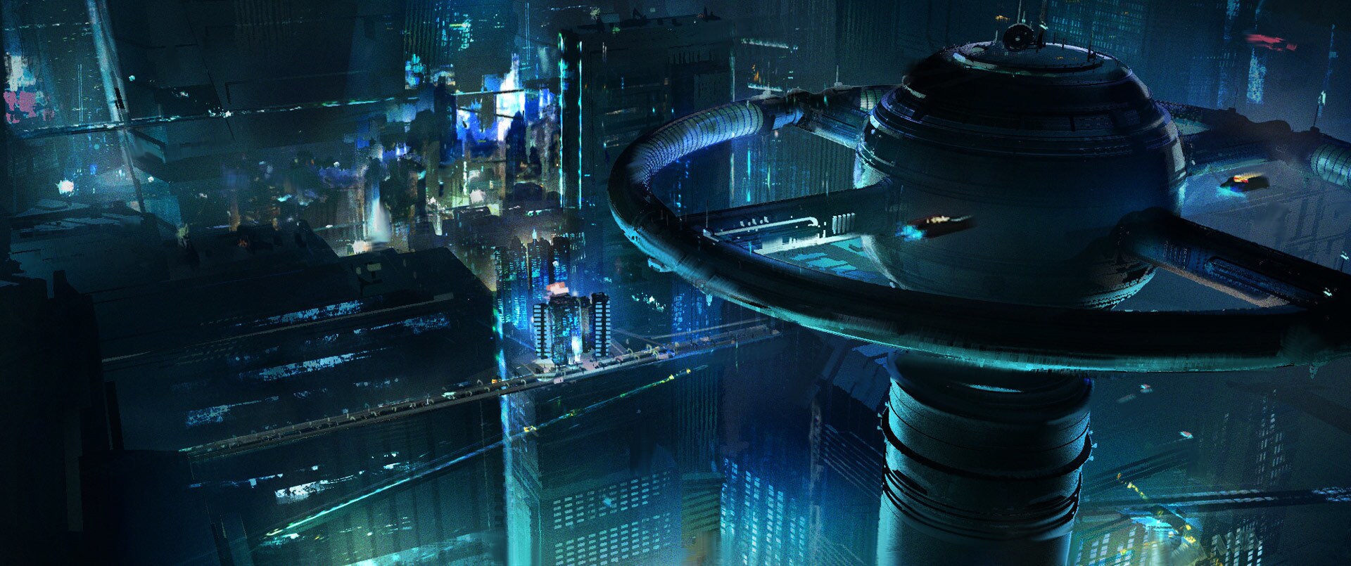
The question behind Janix was not simply how to invent another futuristic skyline. It was how to make a place feel specific to its story.
In Lucas Seastrom’s official StarWars.com feature, art director Andre Kirk describes a city influenced by mid-century visions of the future. Ground-level streets, trains and bridges distinguish it from Coruscant. The team mapped the characters’ journeys so locations would connect logically, even when that planning never appeared on screen.
Paint first, then bring it into CG
Senior digimatte artist Kyra Kabler studied painters including Turner and Sargent, and made gouache cityscapes around San Francisco. The team explored how distant lights, reflections and detail could be simplified into a painterly language.
Joel Aron and Valerie Perez developed ways to integrate brushstroke accents into CG imagery. Aron also photographed real paint marks on glass for use in the image-making process. Supervising director Brad Rau describes the aim as seeing “the hand of the artist in every frame.”
What a concept artist can take from this
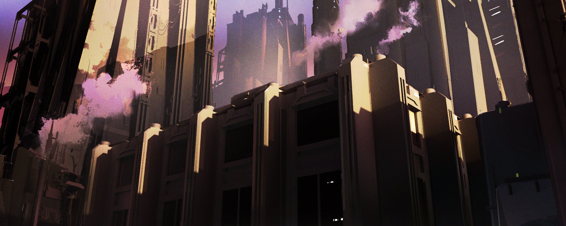
Our reading: a style becomes more convincing when it guides several decisions at once. Here, mark-making is part of a larger conversation about architecture, lighting and the emotional atmosphere of a place. It is not just a texture applied at the end.
When studying the published concept paintings, compare the large masses before looking at the small marks. Where is the clearest contrast? Where do edges disappear? Which details are left for your eye to complete? These are useful questions for a Photoshop study, even if your subject is a real street rather than a fictional city.
The full interview includes concept-to-final comparisons and more of the artists’ explanations. Follow the original feature to see the production context rather than treating a single image as the whole design process.